Wasl.
Elevating a legacy brand shaping Dubai’s urban fabric.
As one of Dubai’s leading real estate and asset management groups, Wasl plays a pivotal role in shaping the city’s urban and social fabric. Established to commercialise and activate Dubai’s strategic land holdings, the group manages a broad portfolio spanning residential and commercial properties, industrial developments, hospitality destinations and community experiences. With Dubai’s continued growth, Wasl recognised the need to evolve its identity to better express its vision and reinforce its position as a catalyst for progress and placemaking.
-
Sector: Real Estate
-
Brand Audit
Brand Identity
Brand Collateral
Environmental Branding
Brand Guidelines
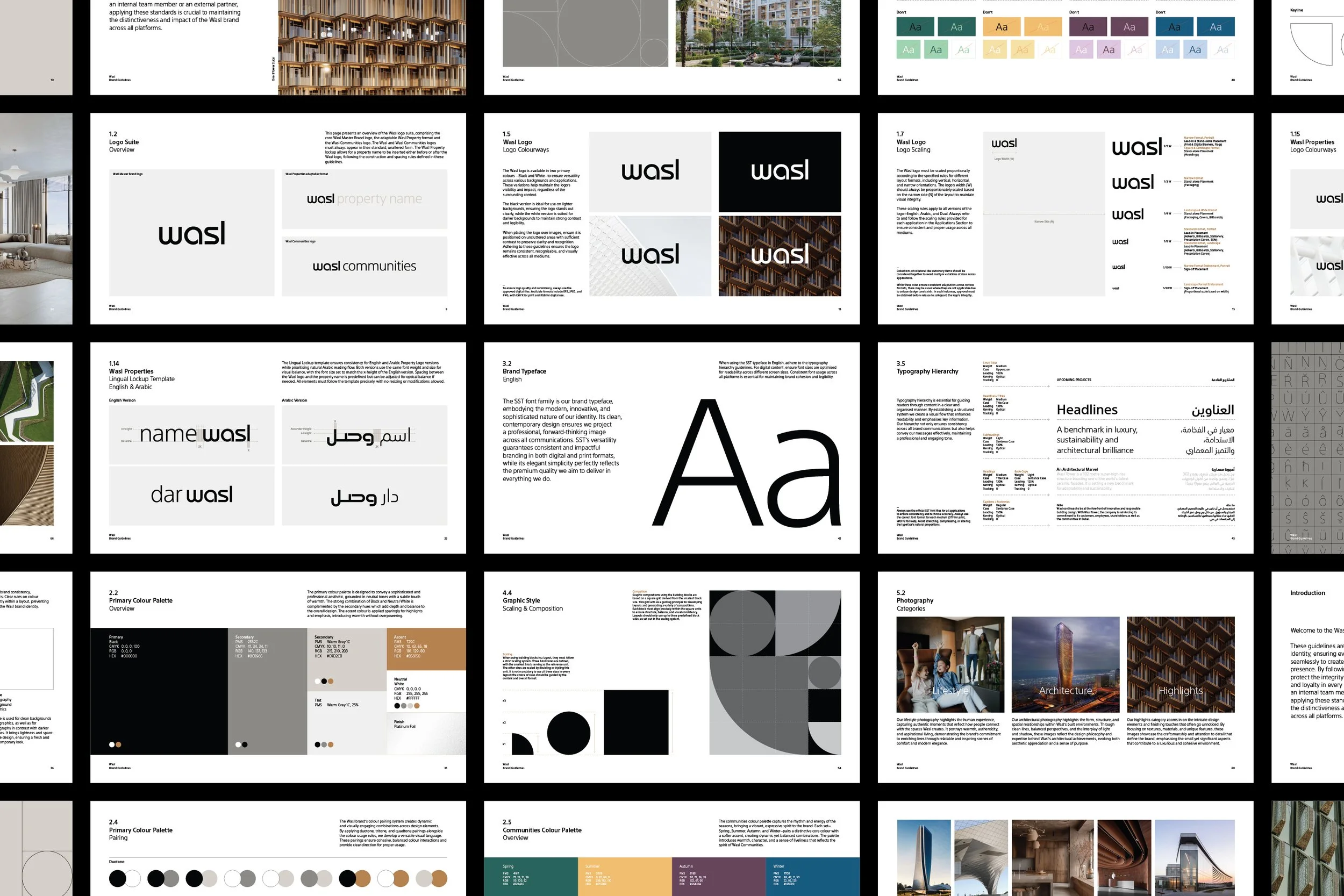
Moloobhoy & Brown were engaged to reimagine the visual identity, bringing structure, simplicity, and creative coherence to a brand with exceptional reach. The process began with a comprehensive audit of the existing system, examining how the identity lived across print, digital and environmental touchpoints. This revealed a fragmented language that lacked flexibility and impact. These insights became the foundation for a complete evolution of the identity.
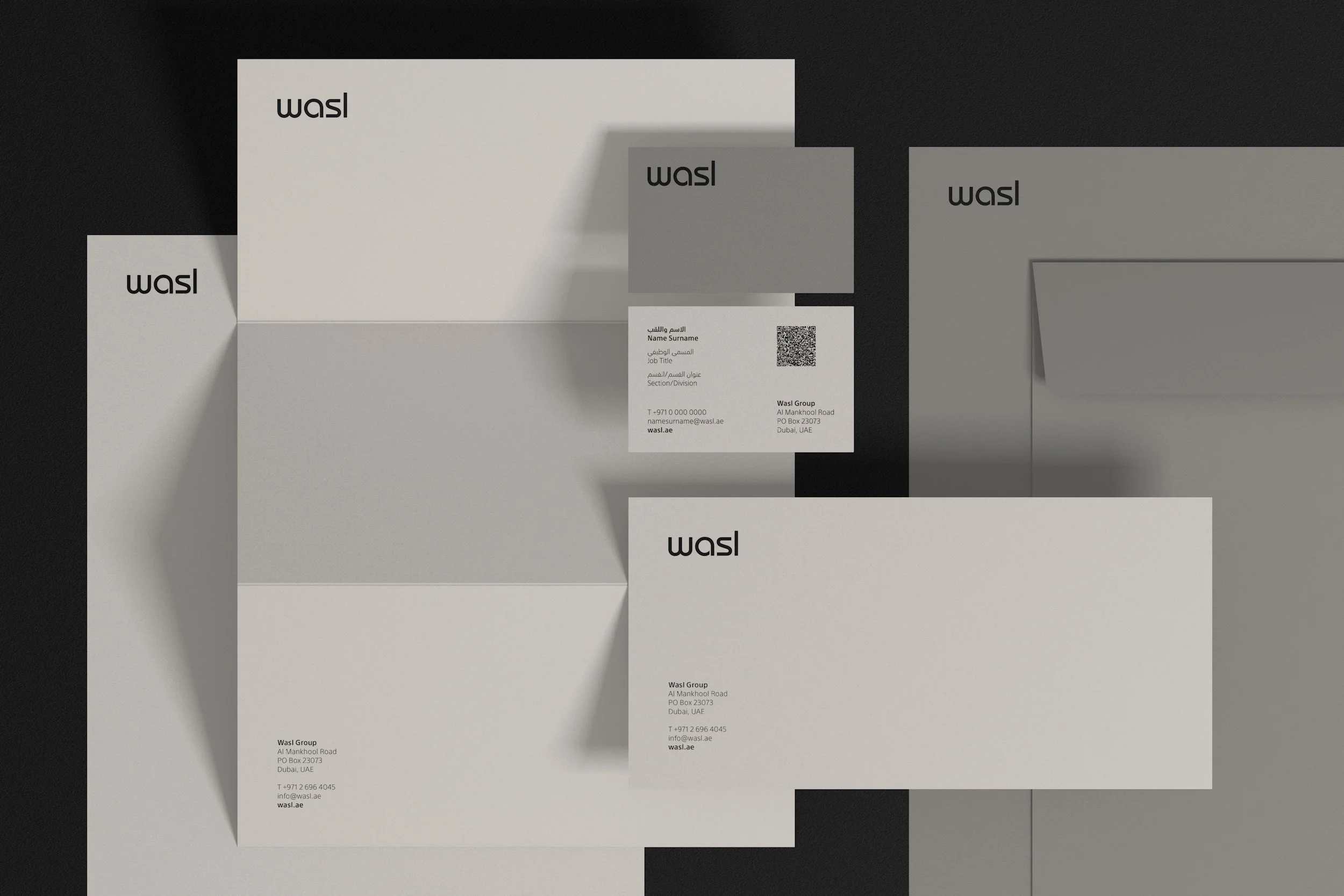
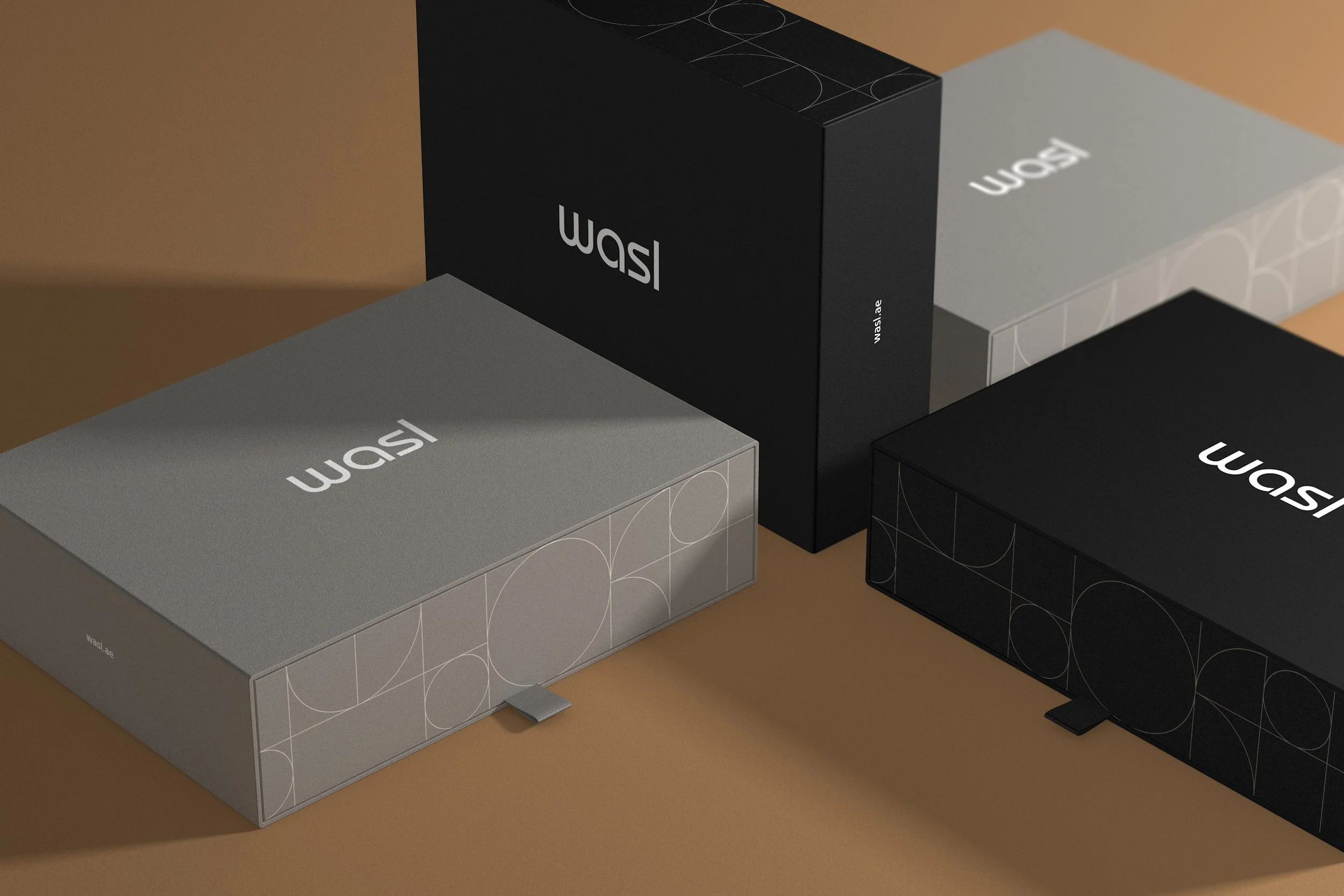
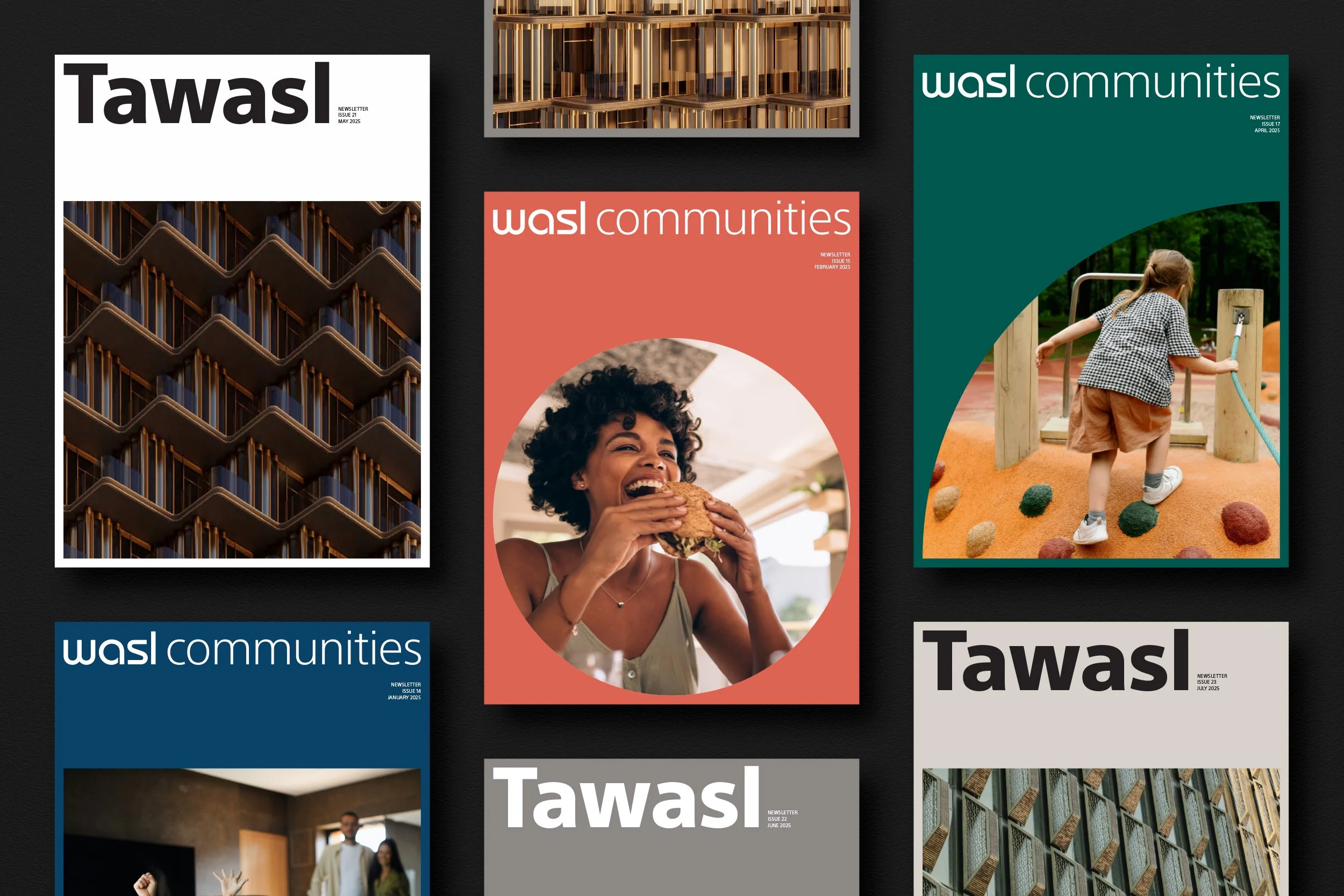
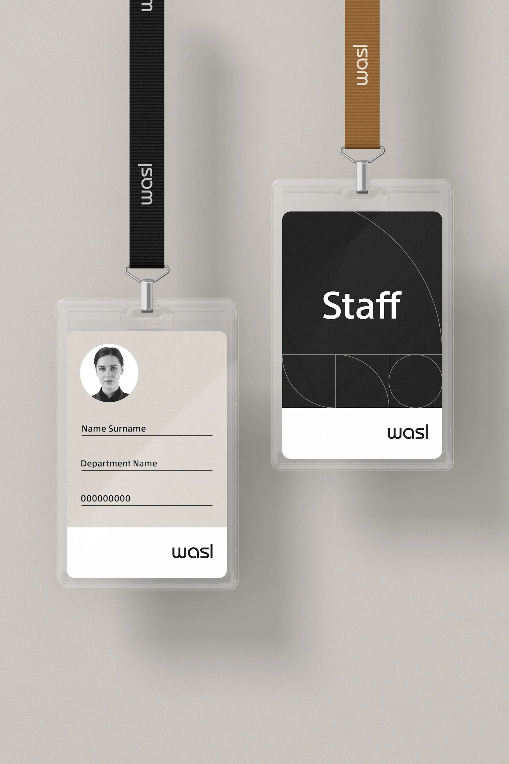
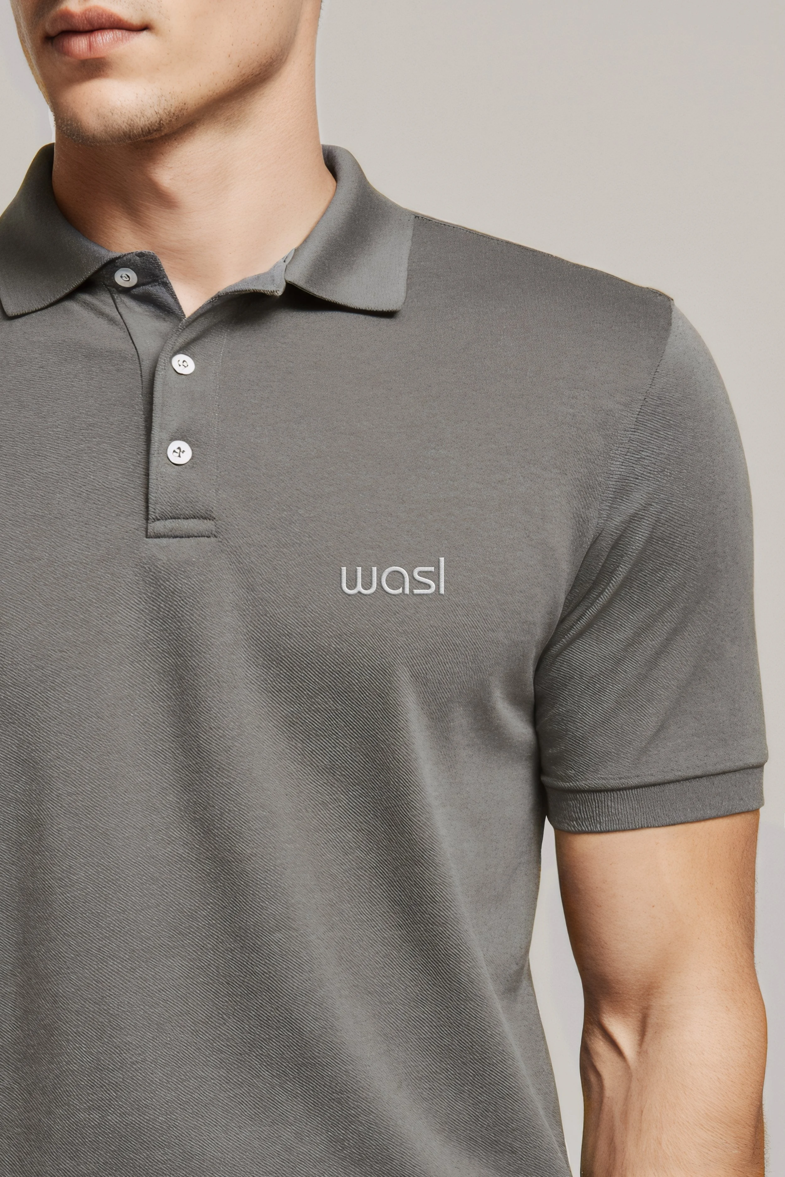
At the core of the work was a rationalised visual architecture. The masterbrand, property, and communities logos were refined into a cohesive, future-facing suite. The colour palette was rebalanced to strengthen the central brand while allowing the communities a distinct yet connected voice. A responsive graphic language, drawn from the geometry of the Wasl logotype, introduced rhythm, movement, and visual harmony across key applications.
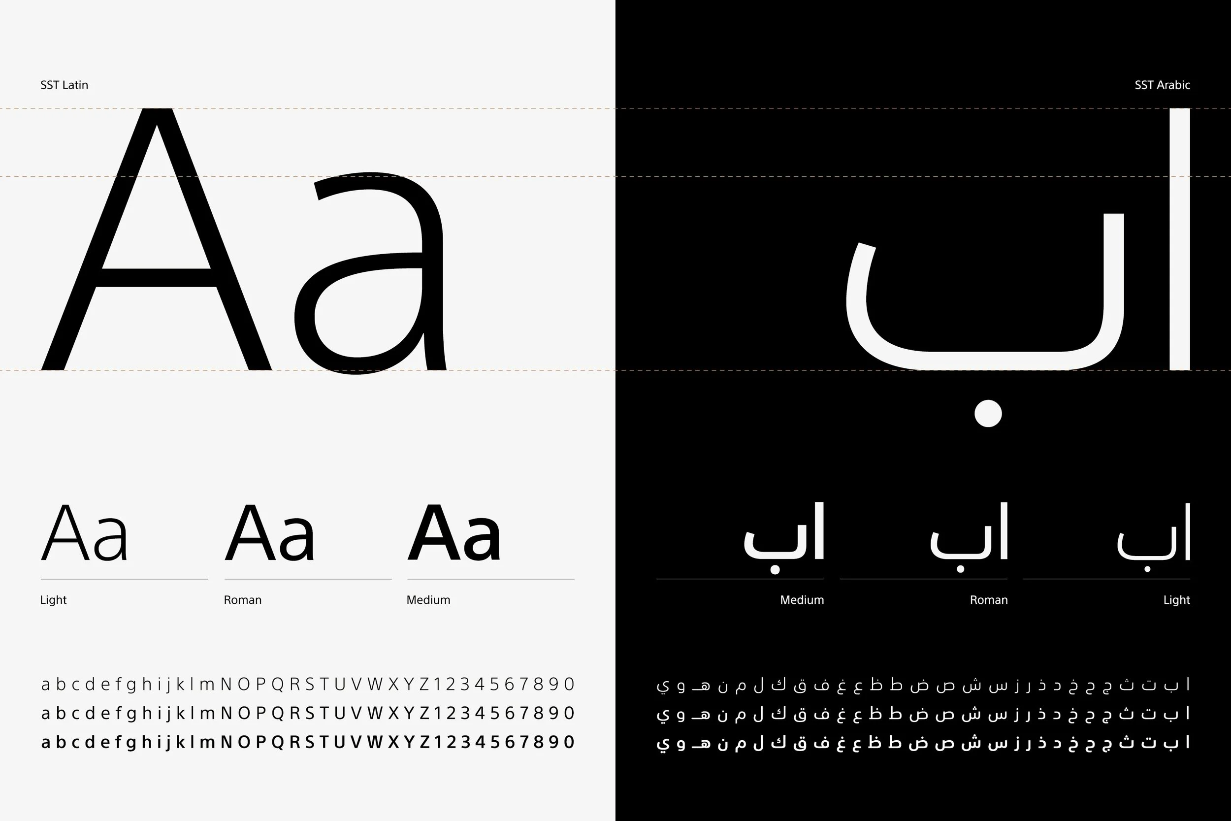
Typography played a central role in this transformation. Through the adoption of Monotype’s SST type family, a seamless bilingual system was established, ensuring clear and balanced communication in both Arabic and English. Comprehensive guidelines were developed to empower internal teams and partners to implement the refreshed identity with precision and confidence.
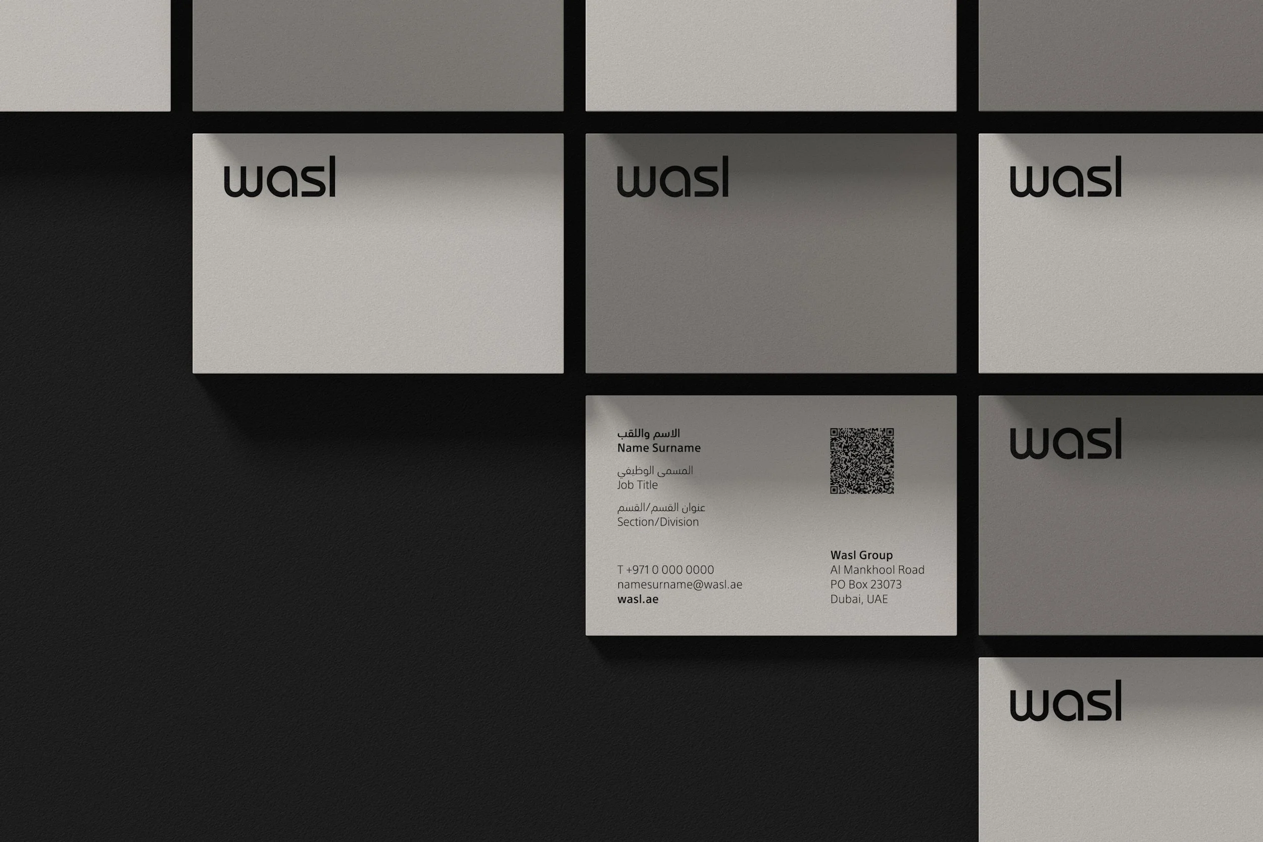
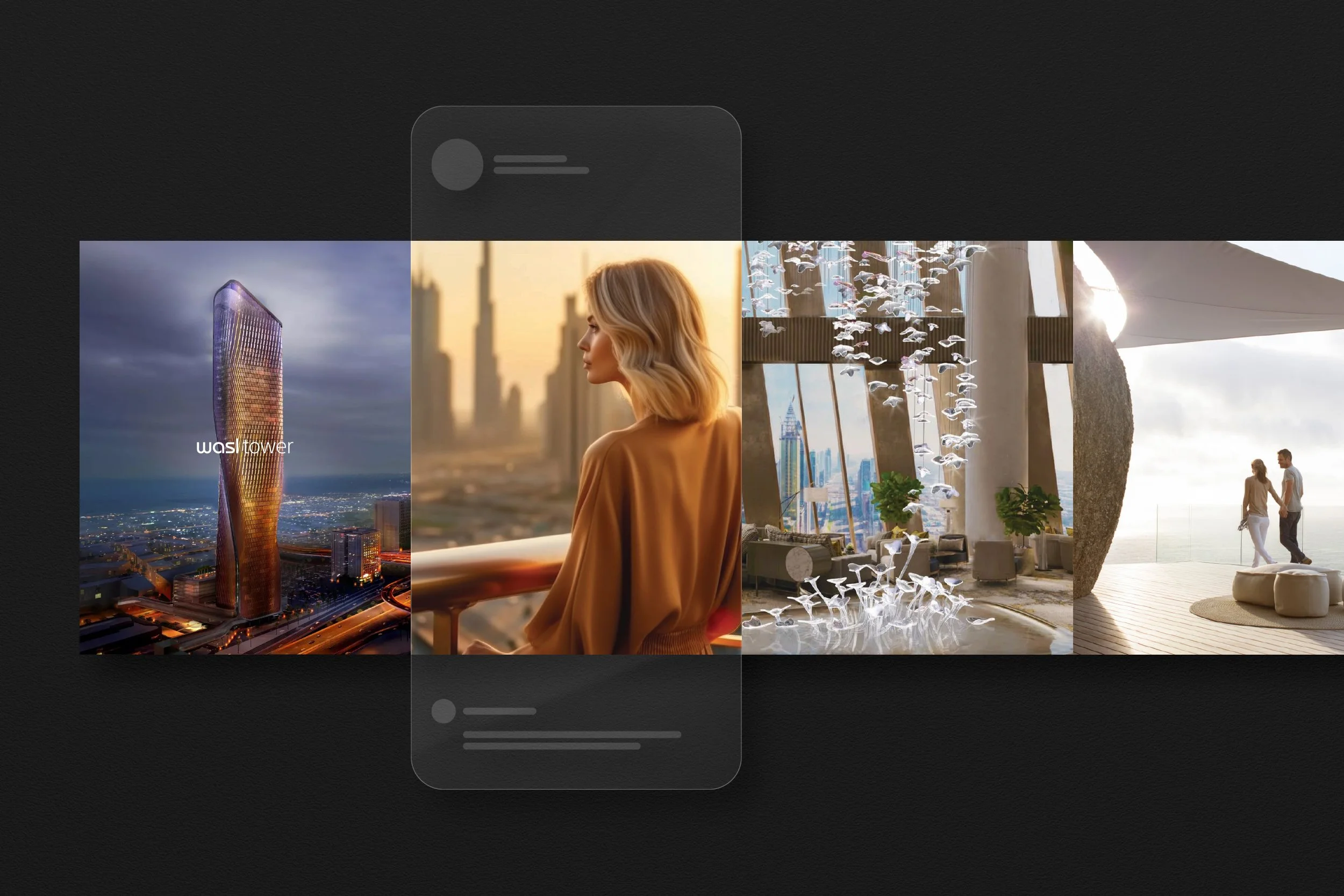
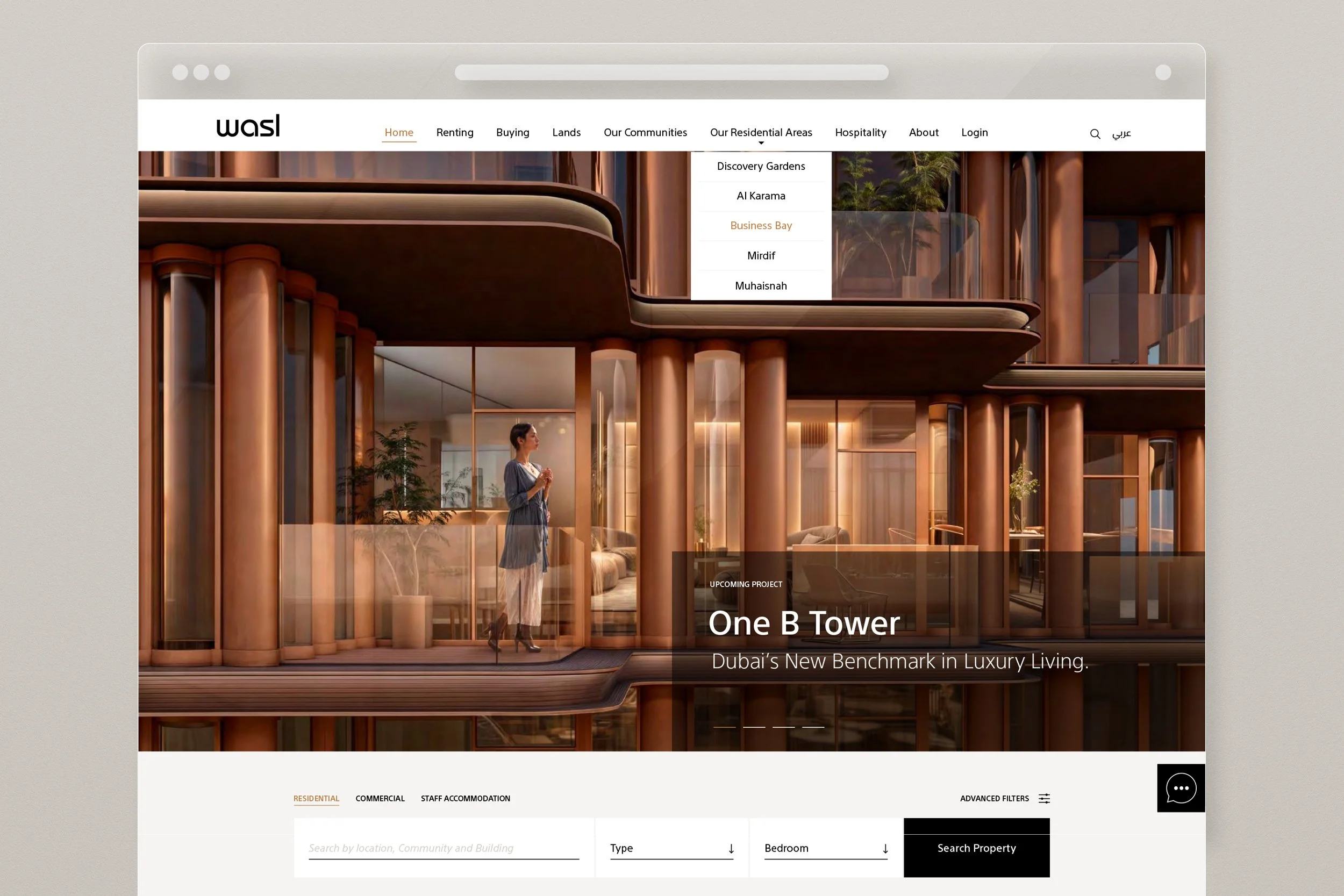
The evolved Wasl identity is now being embedded across a broad ecosystem of touchpoints—from stationery and digital platforms to marketing collateral and environmental applications. The project culminated in the creation of a signage and wayfinding standards system, setting a strong and enduring foundation for the next chapter of Wasl’s growth.
“Everything we do at Wasl is driven by a duty to support the government's vision of making Dubai the best city to visit, work and live in.”
— H.E. Hesham Al Qassim, CEO


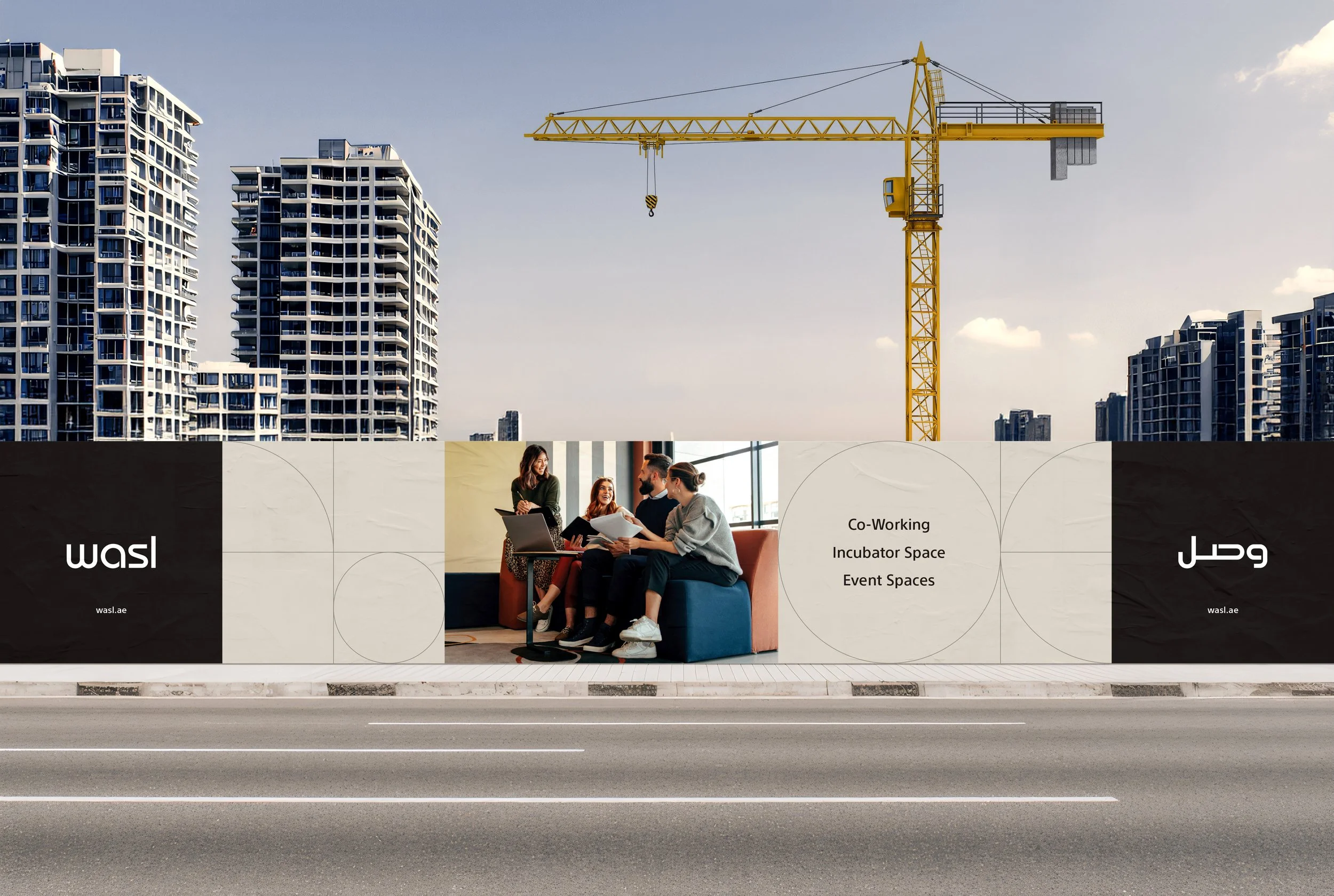
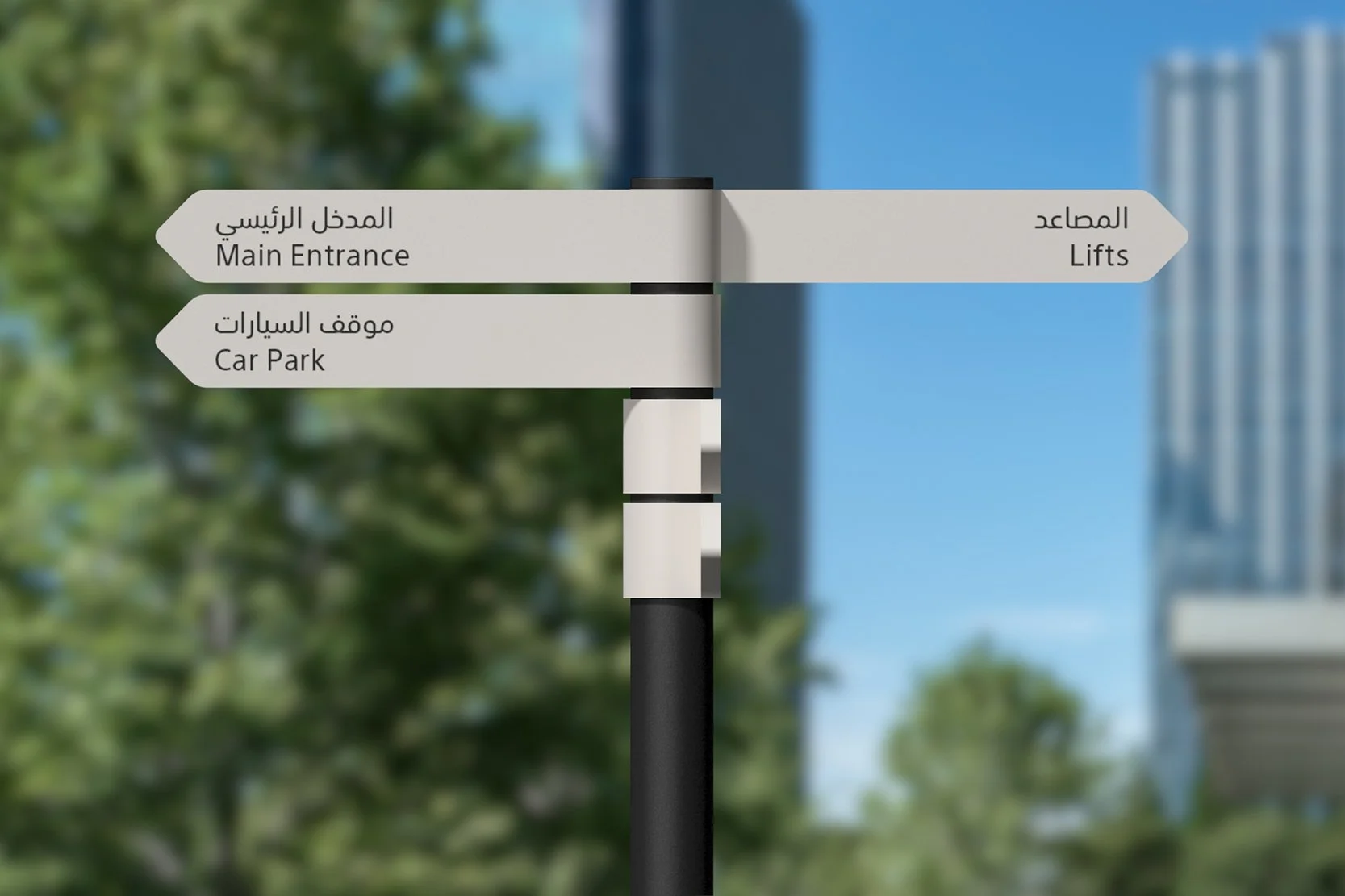
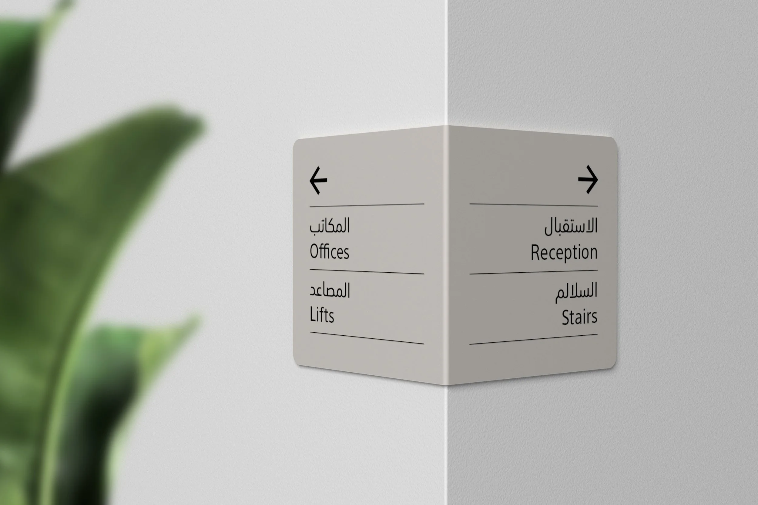
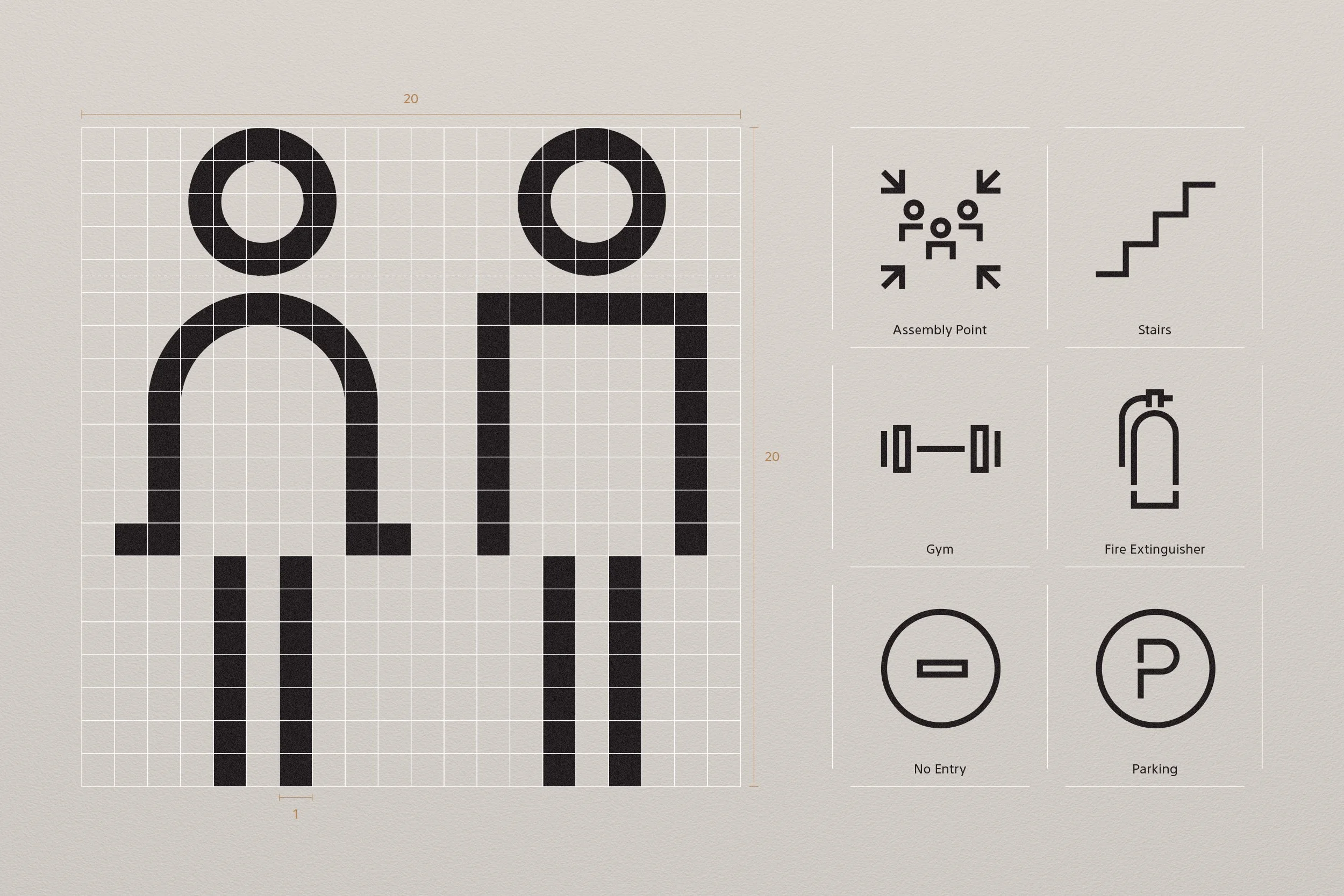
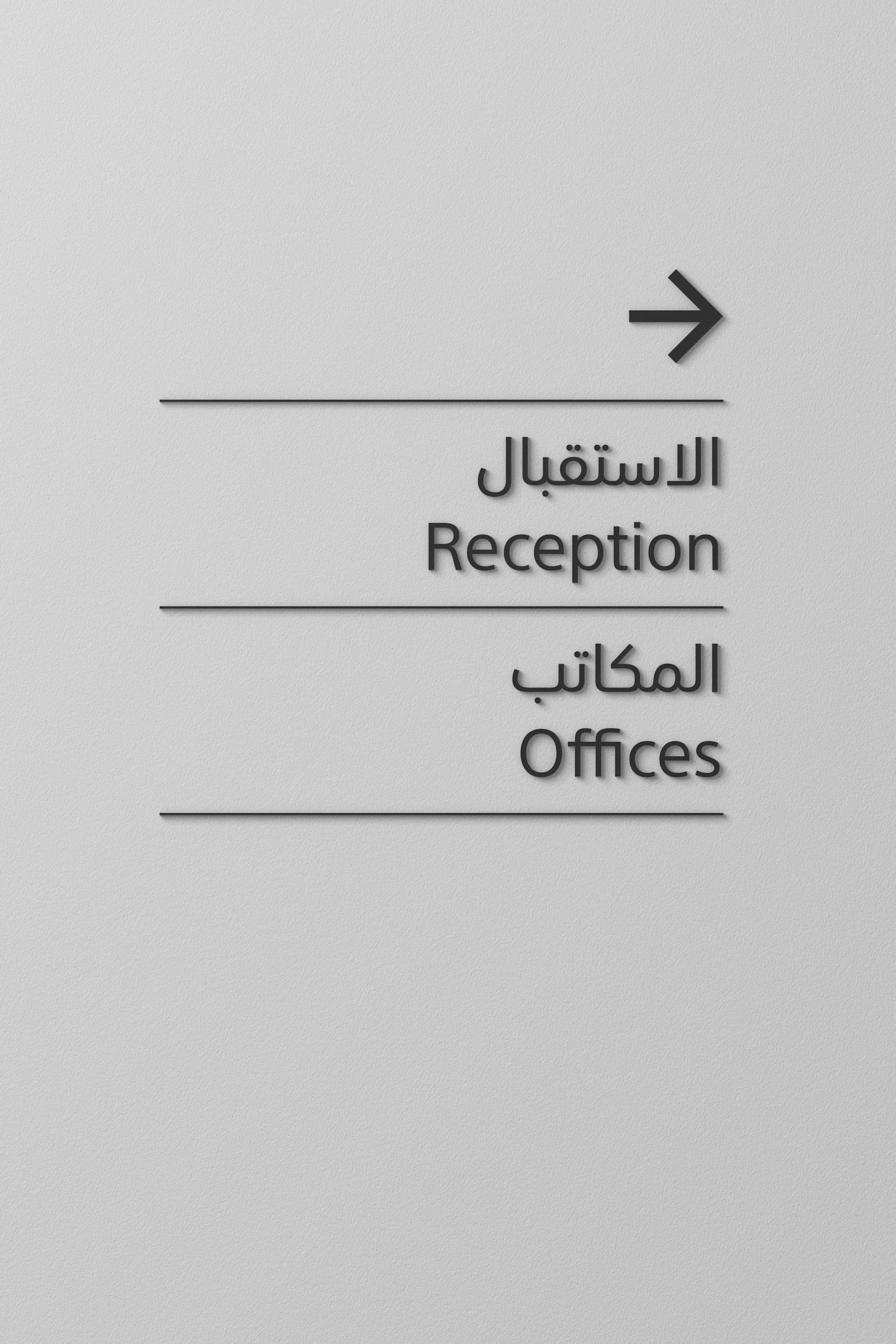
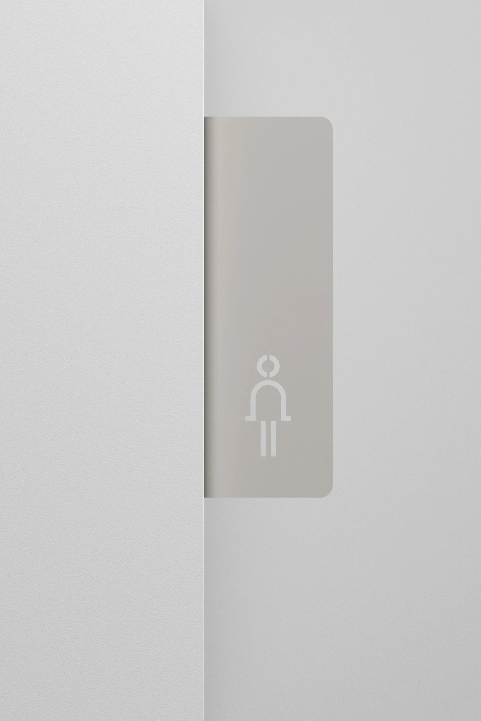
Building on the insights from a comprehensive signage and wayfinding audit, we developed a clear and cohesive design system that brings structure and elegance to the wayfinding experience across Wasl destinations. Establishing a unified framework that aligns seamlessly with the evolved brand.
The system defines precise typographic hierarchies, a distinctive pictogram suite, and a rational colour structure designed to ensure clarity, legibility, and ease of navigation. Each element was crafted to create a consistent language of movement, guiding residents and visitors with confidence and ease. The result is a flexible, scalable standard that can be applied across all future Wasl developments, ensuring every environment feels considered, connected, and unmistakably part of Wasl.